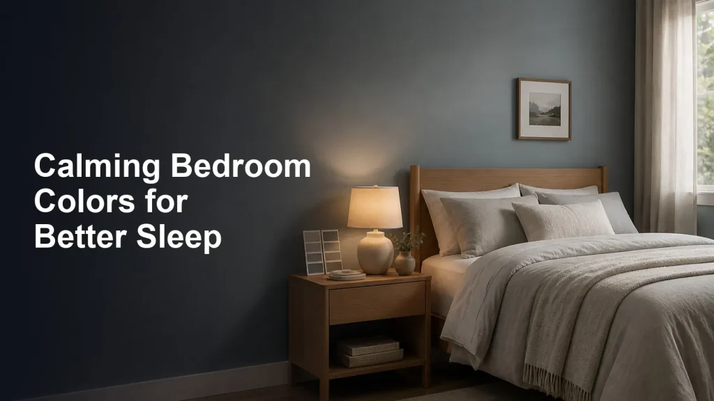
Your bedroom’s color scheme does more than set the aesthetic — it shapes the whole mood of the room, and mood matters enormously for sleep. Soft, soothing colors help your mind unwind, while bold, energizing ones can quietly keep you wired. If you’re planning a refresh, here are the most calming bedroom colors for better sleep, and the shades worth avoiding.
Why Bedroom Color Matters for Sleep
Color influences how we feel — some tones feel restful and grounding, others stimulating and alert. A bedroom should be a sanctuary that signals wind down, so the goal is a palette that helps your nervous system relax rather than switch on. While color alone won’t fix your sleep, a calm, cohesive room genuinely supports the relaxed state that makes drifting off easier. For a wider look at the underlying science, see published guidance.
The Best Calming Colors for a Bedroom
Soft blue. Blue is widely considered the most calming, sleep-friendly color. Gentle, muted blues evoke a sense of peace and serenity and are a classic choice for a restful bedroom.
Muted green. Green is restful and balancing, echoing nature and easy on the eyes. Sage, eucalyptus, and soft olive tones create a serene, grounding feel.
Warm neutrals. Beige, warm gray, greige, and taupe are soothing, timeless, and endlessly versatile, making a calm backdrop that never feels jarring.
Soft earthy tones. Muted terracotta, warm sand, and gentle clay bring a cozy, grounded warmth — perfect for a snug, inviting bedroom.
Blush and soft pink. Far from loud, a muted blush is gentle and warm, adding a soothing, comforting softness.
Lavender and soft purple. Pale, muted purples are associated with relaxation and calm, lending a restful, slightly dreamy quality.
Warm white and cream. Soft, warm whites feel clean and peaceful. (Aim for warm, creamy whites rather than stark, bright white, which can feel cold and clinical.)
Colors to Use Sparingly
Some colors are better kept as small accents than as the main event. Bright, bold reds and oranges are energizing and stimulating — the opposite of what you want at bedtime. Vivid yellows can feel cheerful but also activating. And very saturated or intensely dark, dramatic shades can feel heavy or over-stimulating as a whole-room color. If you love a bolder hue, use it in a cushion, throw, or single accent rather than across every wall.
Tips for a Sleep-Friendly Color Scheme
Lean toward soft, muted, desaturated tones rather than bright, saturated ones — the gentler the shade, the more restful the room. Choose matte finishes over high-gloss for a softer, calmer look. Keep the palette cohesive rather than busy, sticking to a few complementary tones. If you want deeper color, try a single accent wall while keeping the rest soft. And remember your bedding, curtains, and textiles carry color too, so layer them in soothing tones. Above all, pick colors that you personally find calming — your sense of peace in the room is what matters most.
The Bottom Line
For a bedroom that helps you sleep, reach for soft, muted, calming colors — gentle blues and greens, warm neutrals, soothing earthy tones, blush, lavender, or warm whites — and keep energizing brights like bold red, orange, and yellow to small accents. Favor desaturated shades, matte finishes, and a cohesive palette, and carry those calming tones into your bedding and textiles. Create a room that feels like a serene retreat, and you’ll set the perfect mood for rest.
Color is a finishing touch on the rest of the room. Light and heat still matter more; start with this temperature guide.
Frequently Asked Questions
What is the best bedroom color for sleep?
Soft, muted blue is widely considered the most calming and sleep-friendly color, evoking peace and serenity. Muted greens, warm neutrals, soft earthy tones, blush, lavender, and warm whites are also excellent, restful choices for a bedroom.
What colors should I avoid in a bedroom?
Keep bright, bold reds and oranges, vivid yellows, and very saturated or intensely dramatic shades to small accents rather than whole walls, since they tend to be energizing and stimulating — the opposite of what helps you wind down for sleep.
Do bedroom colors really affect sleep?
Color alone won’t fix your sleep, but it shapes the room’s mood, and a calm, cohesive palette supports the relaxed state that makes falling asleep easier. Soothing colors help signal “wind down,” while bold, stimulating ones can keep you feeling alert.
Is a green bedroom good for sleep?
Yes. Green is restful and balancing, echoes nature, and is easy on the eyes. Muted shades like sage, eucalyptus, and soft olive create a serene, grounding atmosphere that works beautifully in a sleep-friendly bedroom.
Should bedroom walls be light or dark for sleep?
Soft, muted tones tend to be most restful, whether light or slightly deeper. If you love a darker, cozy feel, a muted (not overly saturated or harsh) shade or a single accent wall can work well, ideally in a matte finish and paired with calming bedding.

Michael Reeves covers topics related to sleep quality, bedroom comfort, and modern lifestyle habits. He enjoys researching sleep products, recovery routines, and productivity-focused wellness practices to create informative and reader-friendly content. Michael writes about bedroom setup, recovery, and the connection between sleep quality and how you feel during the day.
All guides by Michael ReevesGeneral guidance, not medical advice. If a sleep problem persists or gets worse, speak to a qualified clinician. Medical disclaimer